I’ve had the good fortune to be able to design the covers, along with the layout, for most of my books, and have enjoyed doing the design on several others as well.
.
.
 .
.
.
.
.
.
.
.
.
.
Movie poster for Force Drift
(release date: January 16, 2025)
Not a book cover (obviously), this is a poster that I designed for a film that I co-wrote that was released in January, 2025, and is making a round of festivals. Based on the events that took place in Abu Ghraib prison, it follows an investigation into an experimental military interrogation that descends into chaos. The design of the poster was meant to highlight the two main actors in the film, Nichelle Nichols and Andrew Walker, with a darkened image in the background between them of the subject of the interrogation. The composition also subtly suggests a Nazi swastika. You can find more info on it on the Film page of this website.
.
.
.
 .
.
.
.
.
.
.
.
.
.
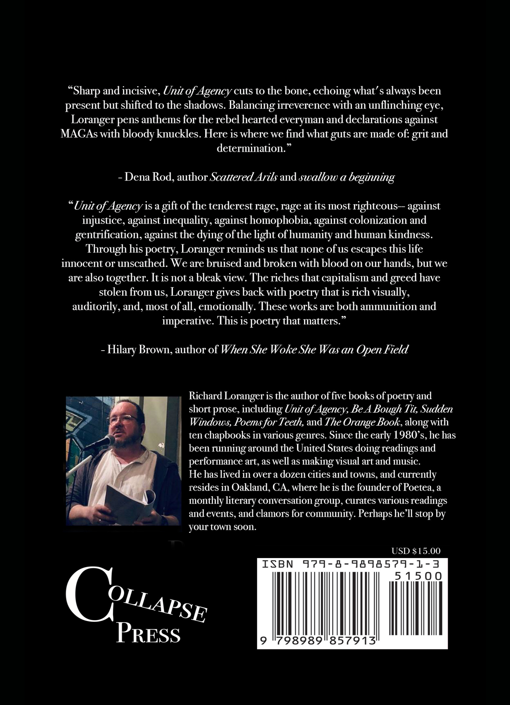
Unit of Agency
(Collapse Press, 2021/24)
Cover design by Lynn Alexander of Collapse Press, using a photograph that I took titled, ““Warden’s House on Alcatraz Island” (2016). I did the layout and formatting for all interior pages for both the first edition (2021) and second edition (2024).
.
.
.


.
.
.
.
.
.
.
.
.
The Ten Thousand
(self-published, 2019)
Two pieces of non-literary spiritual writing, of approximately the same lengths (4 pp. each), designed to each start at one cover and meet in the middle.
.

.
.
.
.
.
.
.
.
.
.
 .
.
.
.
.
.
..
.
.
Sudden Windows
(Zeitgeist Press, 2016)
Cover art by Drew Morrison. Cover design by Drew Morrison & Jane Song. I was responsible for the interior layout and formatting.
.
.
.


.
.
.
.
.
.
.
.
.
.
Joie in Chaps:
The Collected Chapbooks of Joie Cook
(Zeitgeist Press, 2013)
front cover photo by Barbara Landis
back cover painting by Debbie Vinograd
The book features poems organized chronologically by chapbook, and a repro of each original cover for the section heading.
.
.
.


..
.
.
.
.
.
.
.
.
She Is Fighting Love: Selections from the Chapbooks of Joie Cook
(Zeitgeist Press, 2013)
front cover painting by Joie Cook
back cover photo by Richard Stone
The book features poems organized chronologically by chapbook, and a repro of each original cover for the section heading.
.
.
.

.
.
.
.
.
.
.
.
.
.
Take Me To The Porch: Selections from the Journals of Peter Kadyk
(independent, 2012)
front cover flyer by Scot Velardo
back cover self-portrait by Peter Kadyk
.
.
.

.
.
.
.
.
.
.
.
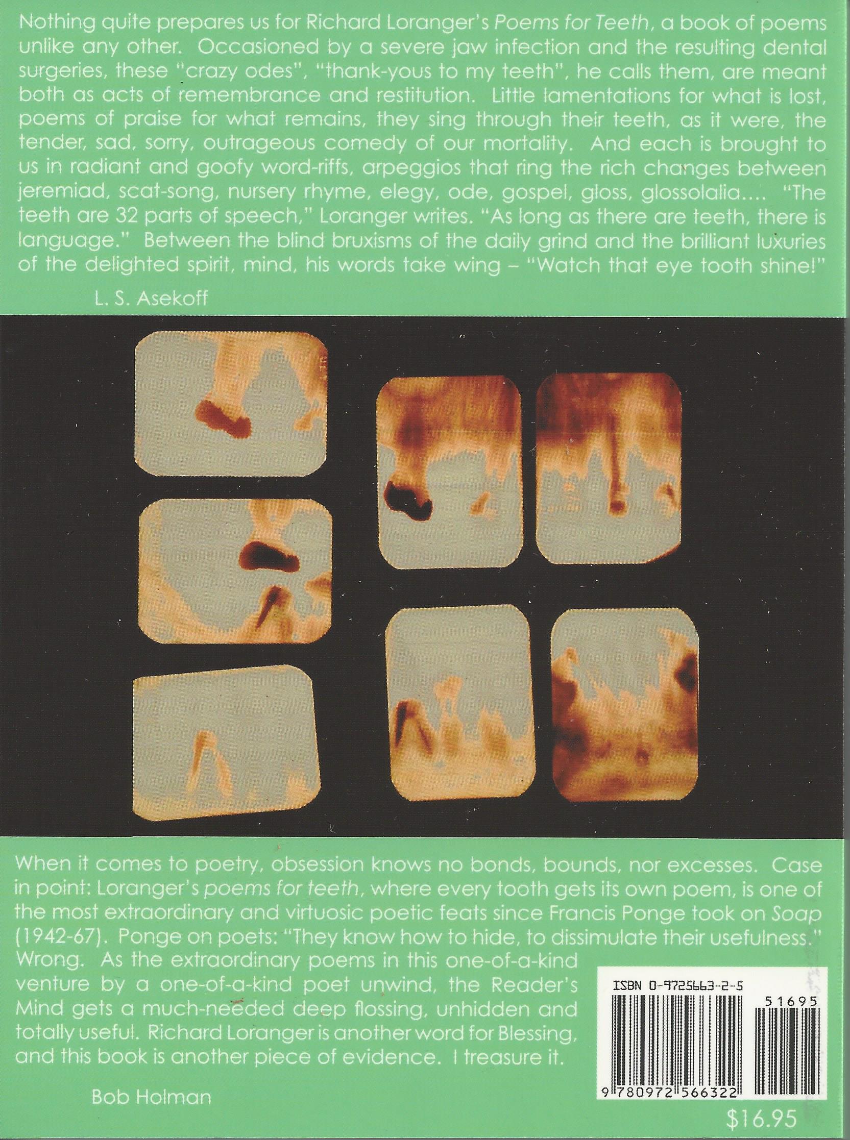
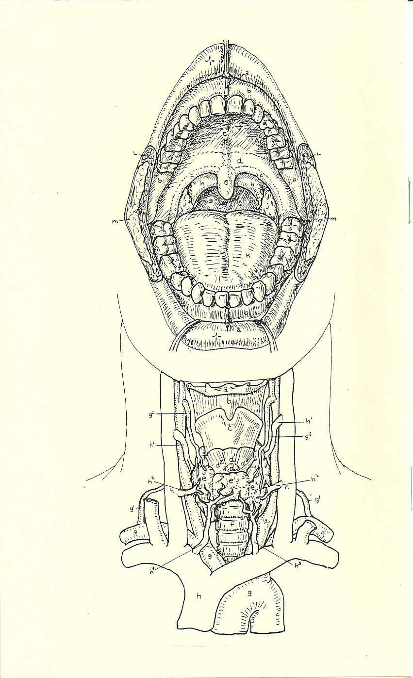
Poems for Teeth
(We Press, 2005)
In addition to cover design and artwork (those are Photoshop distortions of my actual x-rays), layout included a piece of calligraphic art for each poem (done my myself and Eric Waldemar, an alternate contents based on a dental chart, and a songbook and appendix at the end.
.
.
.

.
.
.
.
.
.
Hello Poems
(We Press, 2003)
Purposefully simple design includes a stark cover, simple stapling, single-sided printing, and no page numbers. Also it’s purposefully ambiguous as to whether the book is titled Hello. or Hello Poems or what. You decide.
.
.
.
.


The Day Was Warm and Blue
(self-published, 2002)
Featuring four different covers from my own illustrations, with identical contents.
.


Arranged in this fashion, the pictures come together to create a scene of a sunny, happy day.
The inside front and back covers contain hand-pasted swathes of torn blue construction paper.
.
.
.
.


.
.
.
.
.
.
.
.
.
Brooklyn Review 18
(Brooklyn Review, 2001)
cover photo by Leigh Loranger
.
.
.
.
.
.
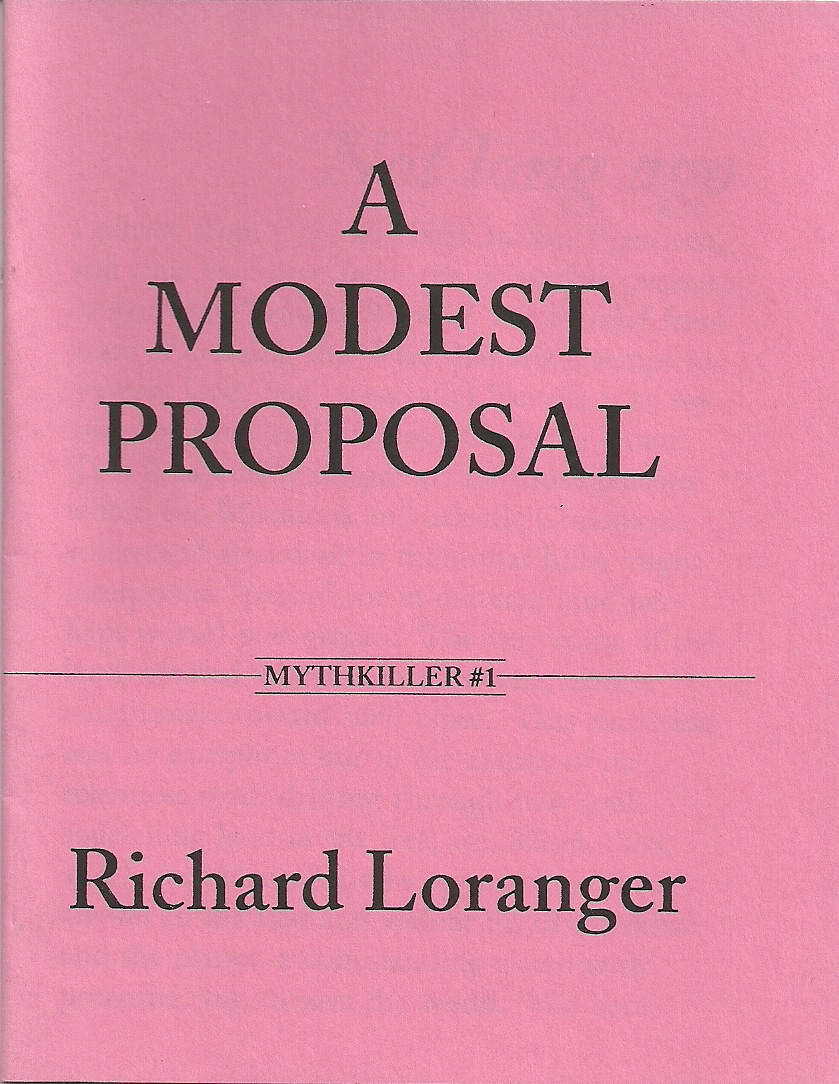
Mythkiller #1: A Modest Proposal
(We Press, 1994)
Raided the copyright free art books for this fine illustration; the front cover seemed to need no explanation.
.
.
.
.
.

.
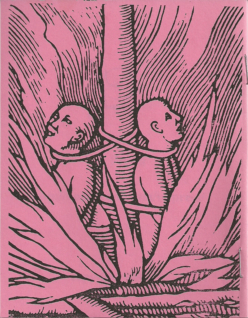
Mythkiller #2: My First Disillusionment
(We Press, 1994)
More copyright-free raids for the front; a collage courtesy of the Anatomy Coloring Book (my fave!) for the back.
.
.
.
.
.
.


.
..
.
Mythkiller #3: The Purpose of Rash Action
(We Press, 1994)
The back cover features a top secret mandala from the central computers of AT&T. ‘Nuff said.
.
.
.
.
.
.
.

 .
.
.
.
.
.
.
.
.
.
The Orange Book
(International Review Press, 1990)
First page features a smaller version of the front cover, so the reader can see the entire title (whew!). Book includes both poems and illustrations by myself, and an arts and crafts project at the end where the reader can construct Mobius strip poems.
Poem on the back cover is not reproduced elsewhere in the book.
.
.
.
.
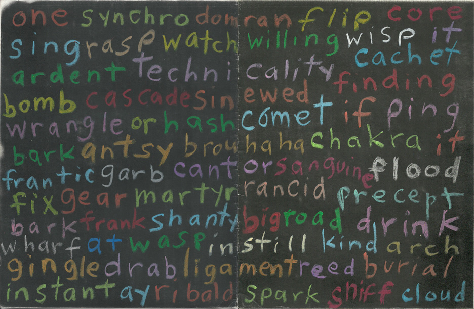
Influx Blinklists
(We Press, 1990)
100 individual covers were handmade by a variety of artists using oil pastel on open-face 11×17″ photocopies. (We were in a hurry for black paper, and it was after midnight.) All were constructed with word-tangles of different sorts.
This one was done by me.
Go to the Books & Chapbooks page to read one!
.
.
.
.
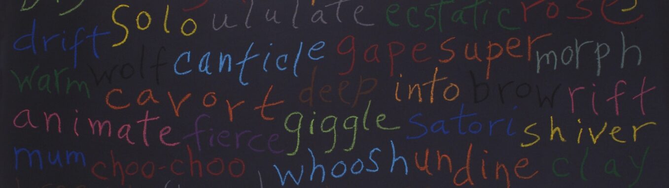
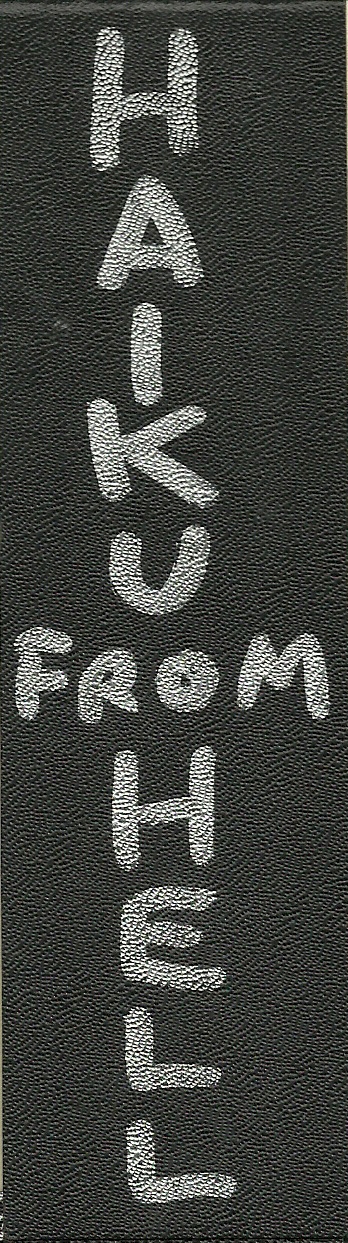
Haiku from Hell
(self-published, 1989)
I “hand-calligraphied” this limited edition chapbook with silver and black markers, issued as 17 copies of 17 haiku 17 syllables each, written by myself and two friends. The cover stock was a plastic faux leather, trimmings from a letterpress publication by Manroot Press. They were a gift from Paul Mariah.
Go to the Books & Chapbooks page to read one!
.
.
.
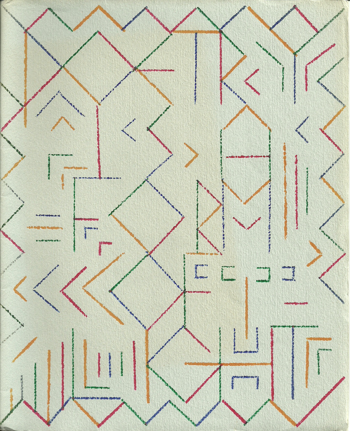
Poetry is a Form of Light
(Clamor Press, 1985)
For my first chapbook I designed hand-printed covers, done with handmade rubber stamps on cotton rag. The design was first done on graph paper, then divided into red, green, blue, and orange lines to complicate the pattern. I produced the stamps by gluing strips from a rubber mat on four rubber-coated blocks of wood, then built a special stamping board to ensure color registration.
Few people notice initially that besides a few “hidden” images, the cover spells out the title of the book.
.